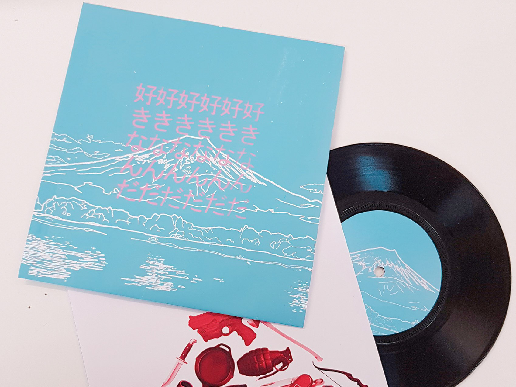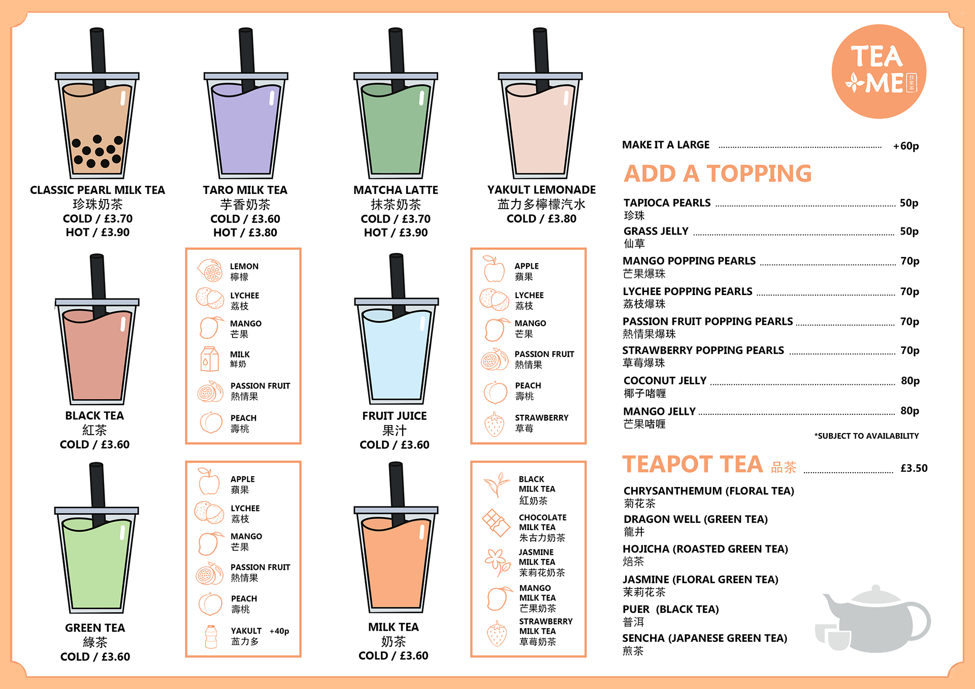
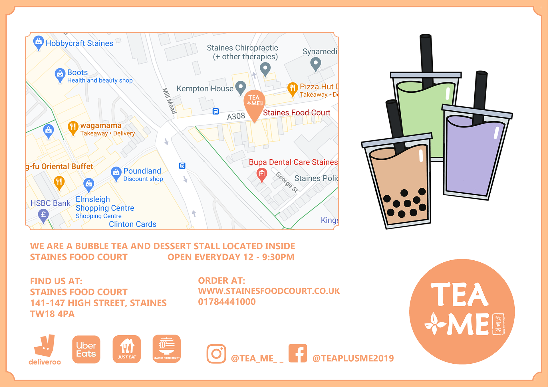
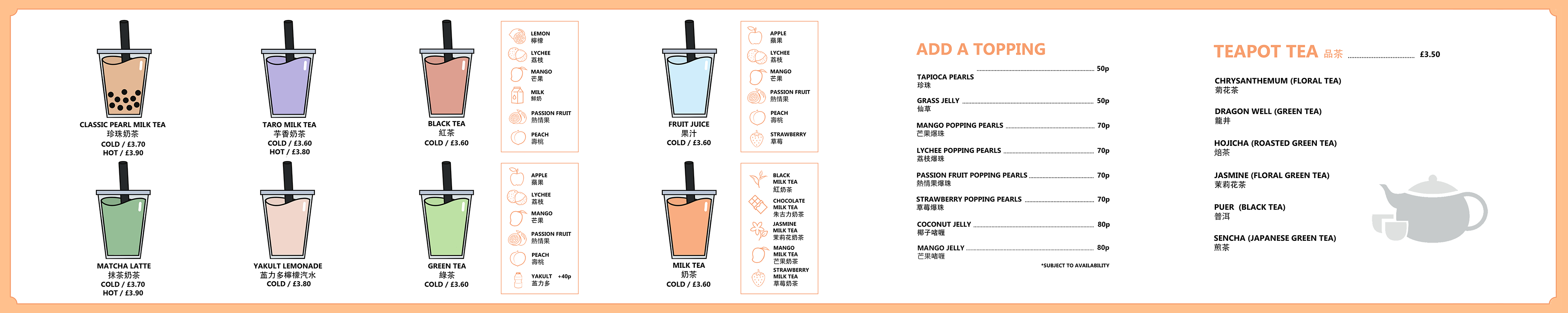
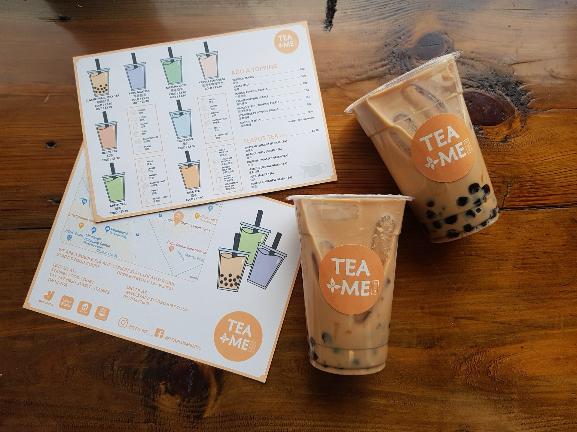

Creating a menu flyer and banner design for Tea Plus Me 我家茶. Working with the client to produce an up to date design for the shop. Making sure layout and composition is clear so that the audience may read it. Creating a fresh and minimalist design which highlights the tone of voice of the store. As Tea plus Me is also targeted towards Chinese families, the business wanted the menu to be in Chinese and English. Due to this, spacing and layout had to be highly considered, as the design might look too crowded. To solves this, the menu has been designed in the format of columns to help separate each drink so that it is easier to read. The illustrations have also be considered due to the space and text. By having minimalist illustration is does not over power the page and keeps the design neat. Along side the menu design they also requested a banner menu which would displayed at the front of their shop. Adjusting the design into a banner format the ideas of columns have also been used for the banner so that it easier to read.