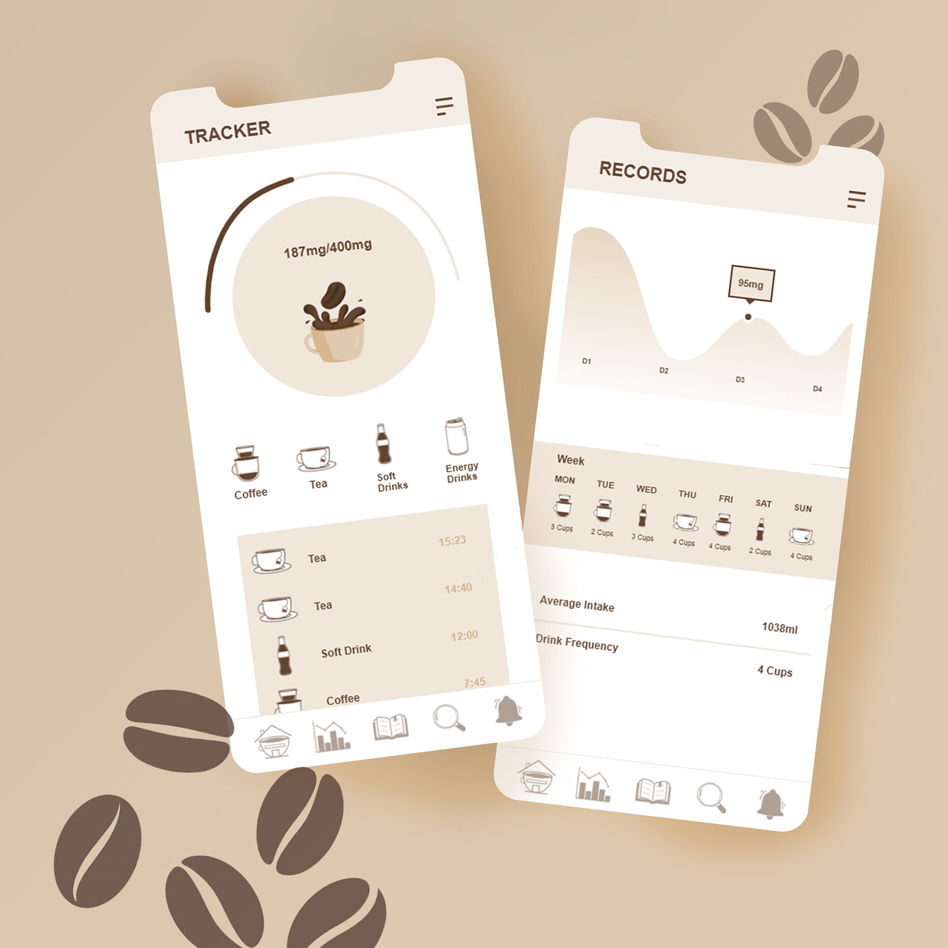
Creating an interactive interface design which helps audience with a caffeine problem, to track their intake. Creating layout and icons which are suitable and relevant to the design. Wanting to keep the design as minimalist and clean as possible, so that it highlights the context instead of the design itself. Thus, having a simple layout and a neutral colour pallet allows the app to have an informative look. The colour theme was a warm earthy pallet as not only does it relates to the colour of coffee but it also gives off a warm and welcoming feeling. Which is what the app wants to represent to the user, that sense of safety and comfort. Considering how the user would navigate through the app and how long they would be active on the app, the design made of the the information is clear and precise. Like other tracker apps, the audience don't spend a lot of time on the app itself as it's their so they can input their data. Thus having a navigation system that is to the point is most effective, so that the user can access the information quickly at a glance.
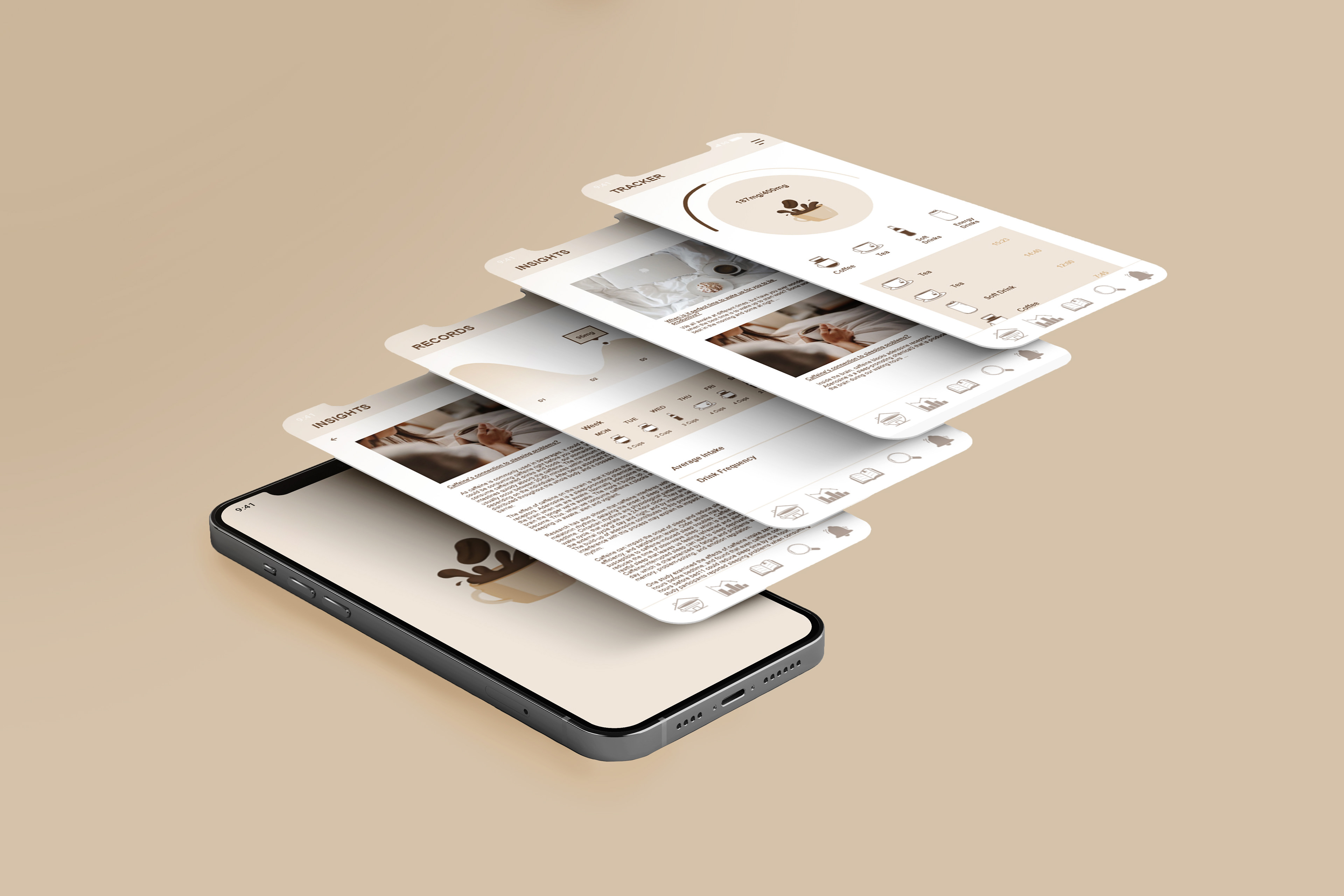
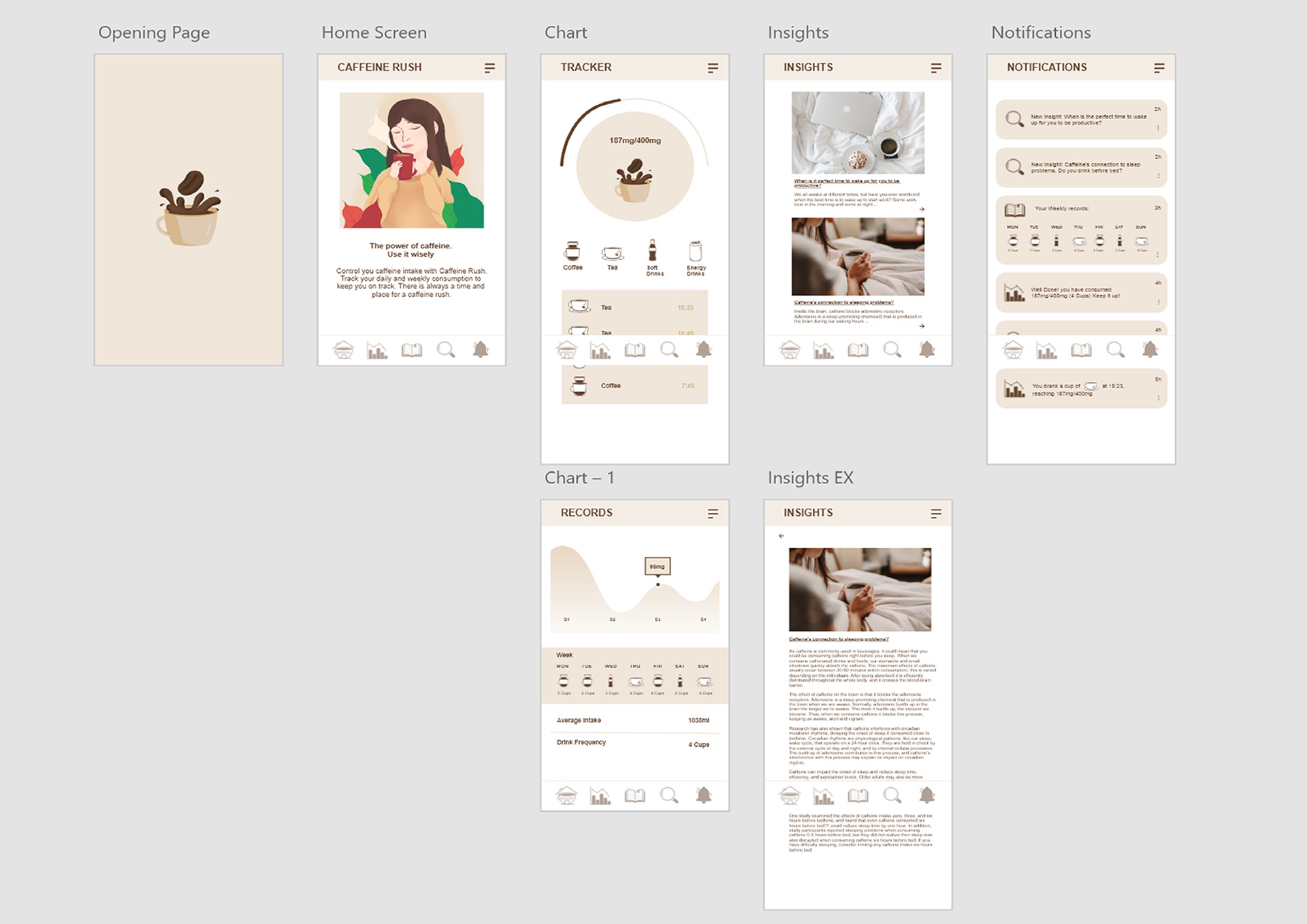
The logo design is of a coffee bean being dropped into a cup of coffee. The idea behind this it when someone thinks of caffeine, they would immediate think of coffee as that is something people to have the most effective caffeine. Thus, having an iconography that would be relatable would be most effective. The logo also follows the natural colour theme so that there is a clear brand identity. Keeping the logo simple a clear was important in highlighting the apps context. In addition, keeping it minimalist help give the app that informative tone of voice, which is the purpose of this app.