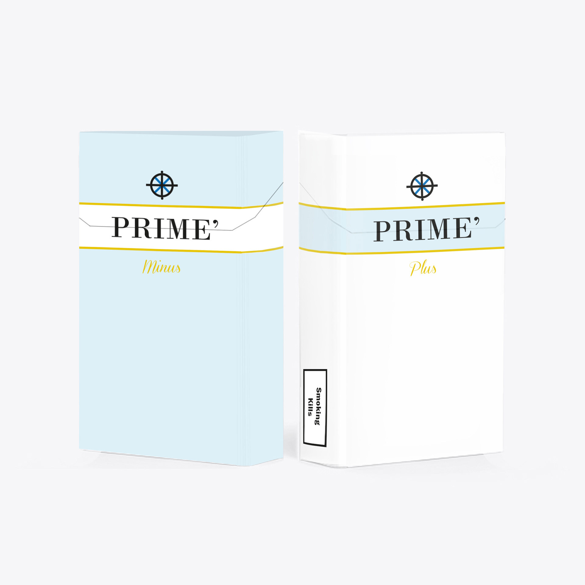
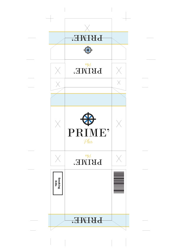

Collaborating with a student director, the aim was to create props that would be featured in a short film. Taking a scene from the script and focusing on the props that will appear in that frame. The designs needs to be appropriate to the audience and also have a realistic visual to enhance the fact that the film is set in contemporary time. Following through with the concept of have the word split in half when opened as a concept that the director liked, however the idea raised that the audience may not be able to see the name clearly, thus at the back is designed so that the name and logo cover the entire back, having a clear communication of brand. In addition, the design is changed for the flavor of the cigarette. The Plus is a strong flavored cigarette while Minus is a smoother taste to it. The audience is able to differentiate the flavor due to the colour of the packaging. There are two designs so that if the director chooses to use the prop again she has a choice from two design, and due to the fact that they are cohesive it will support the mise en scene