Series of magazine covers for Hakai Featuring a cover design, feature story, and department spreads, the project explores the strategic and hierarchical aspects of typography for magazines. For the cover of the design we decided to stick to the theme of collages as it is interesting and engages the audience. The iconography of the cover tells an insight into a story without words. It does not tell the whole story so that it leave enigmas, to make the audience want to read more about it. Deciding to have a white border around the image so that there is a balance and enhances the image. As there is a lot going on in the image, that the border helps the image breath more and does not overwhelm the page. In addition, the position of the image has been moved to be centered so that it is the main focus.
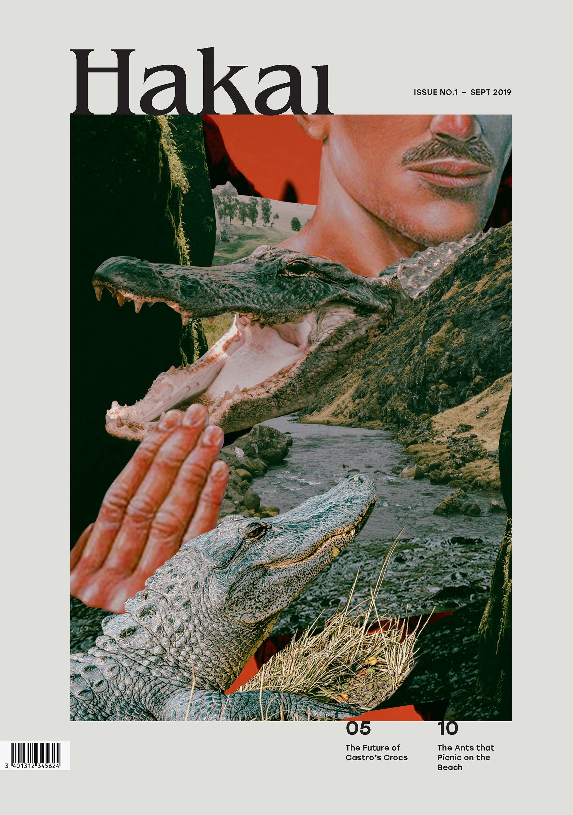
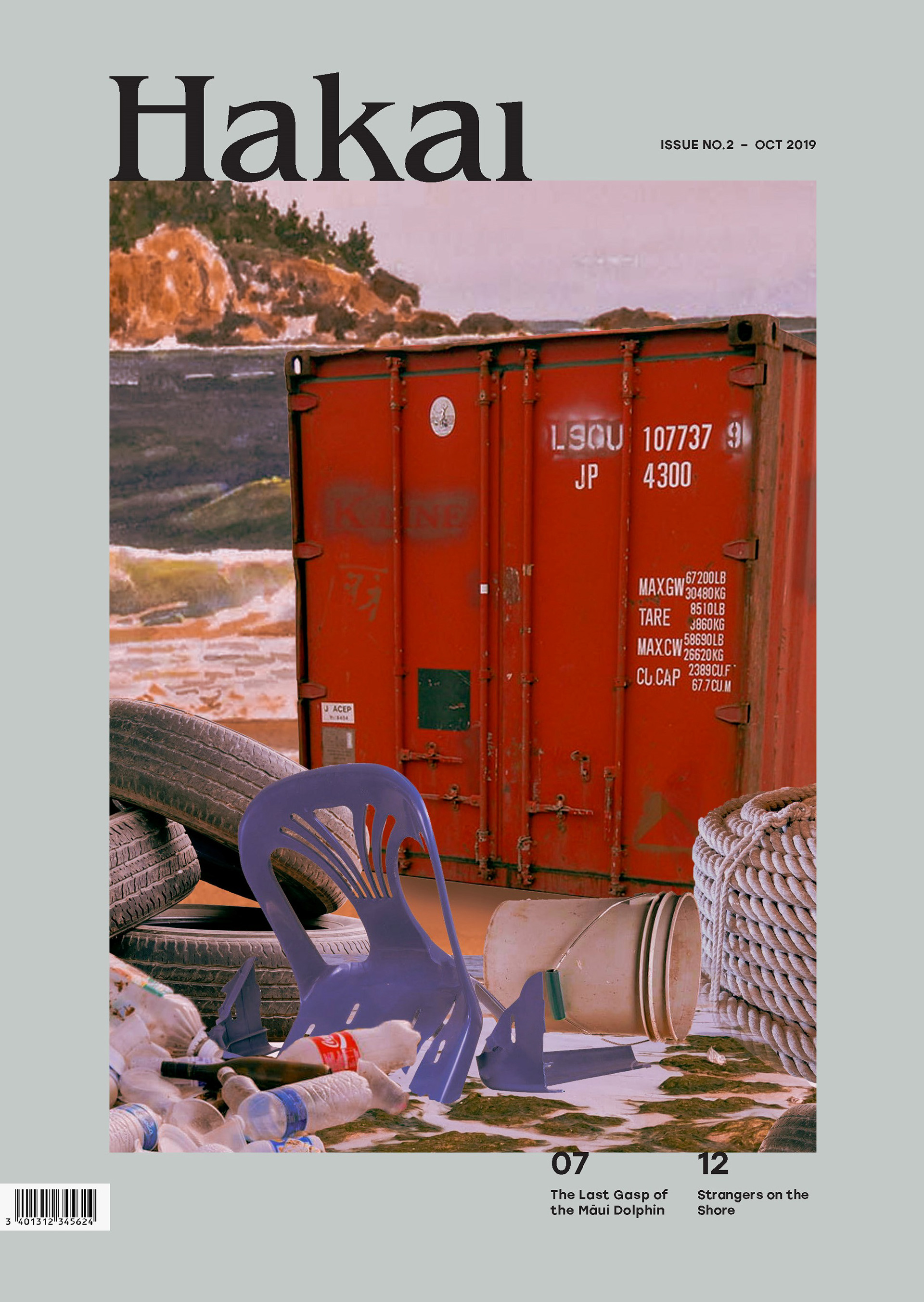
Originally the image was placed on the bottom right and the cut lines were placed on the left so that the audience can read the cut lines and link it to the image. However, by overlapping the cutlines and the image made it very difficult to see the typography. Experimenting with different colours to try to eliminate this problem, but wanting to keep the cohesive colours palette it was difficult to find the right colour for it. On the other hand, changing the size of the text so you could see it better, however this did not make much difference. Thus, changing the format entirely so that the cutlines are now at the bottom right of the page. Furthermore, to this deciding to reduce the font size so the image is the focus and having all the text in black to keep it simple.
The article is about the endangered Japanese Iriomote Cat. Most people would not know how this cat would look like, as they are uncommon and due to numbers decreasing there are fewer sightings. When looking up images online there were not many images of these cats, and the ones that were there weren’t very clear and could not be used in a good quality magazine. To solve this an illustration of the animal would be most effective and the best way to communicate to the audience. In addition, as these cats are seen as sacred animals there are many traditional drawings of them because in the Japanese culture to paint or draw something it means a great significant.
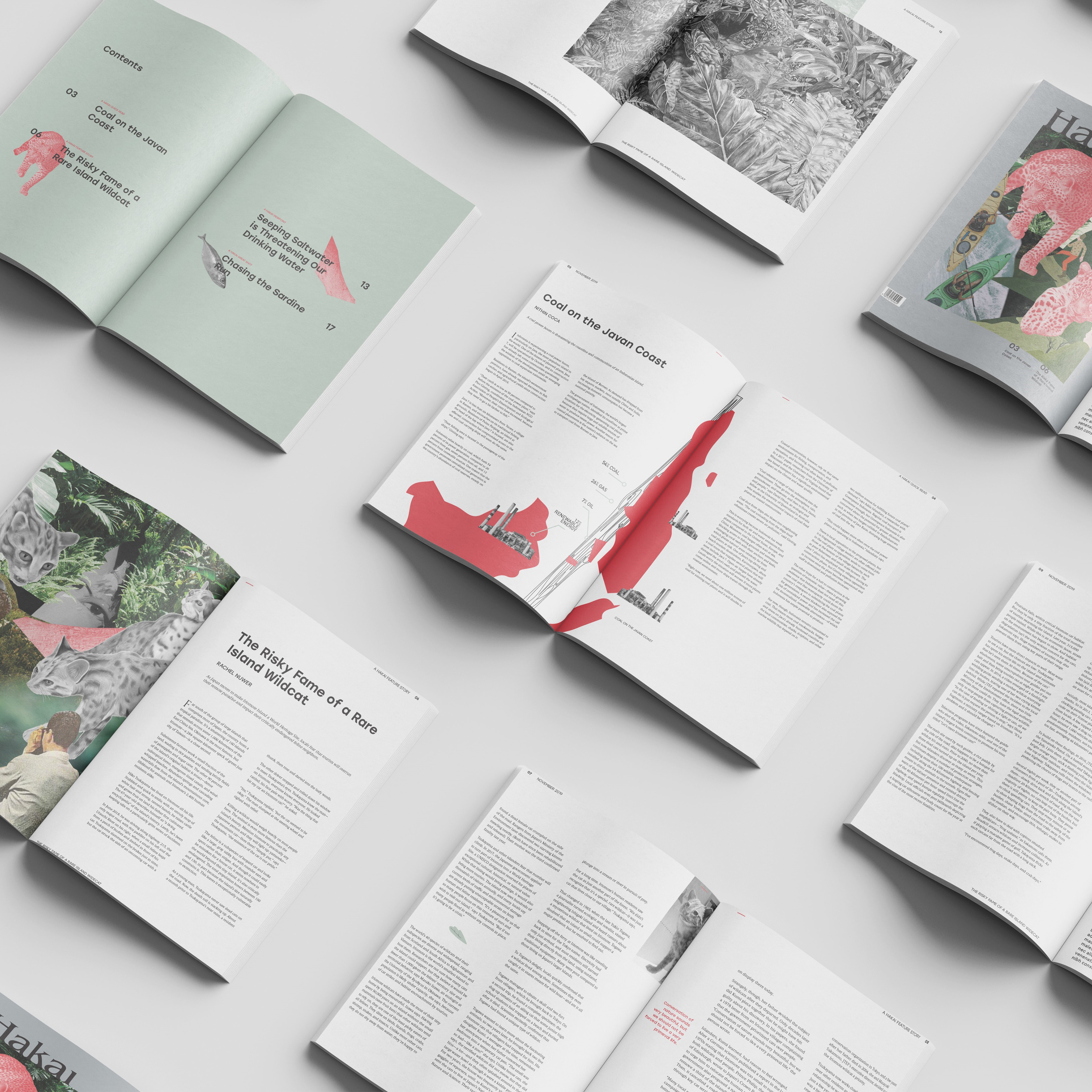
Considering to do a series of illustrations so that they are all cohesive and look like they are from the same article, also using the same colour throughout makes the 4 page article flow well together. The digital drawing itself are detailed, so that it has the exact depiction of how the animal would look like in real life. The position of the cat is in different action stance so this engages the reader making them appreciate the art work and also wanting to read more about this topic. The illustration is done on a white background to give it some white space allowing the detailed image to stand out more. This is because when drawing it did originally have the grass green background, but we found out that it didn’t make the cat stand out as much as on the white. Also because so much is going on, on the page, the background disrupt the entire image and making it too overpowering. Thus keeping it simple yet detailed makes it easier to see and communicating the point directly.