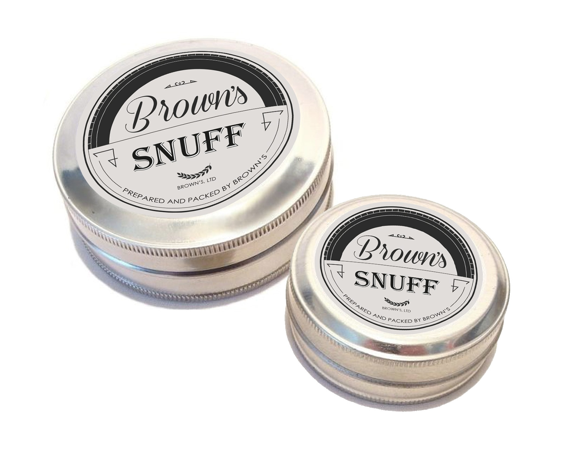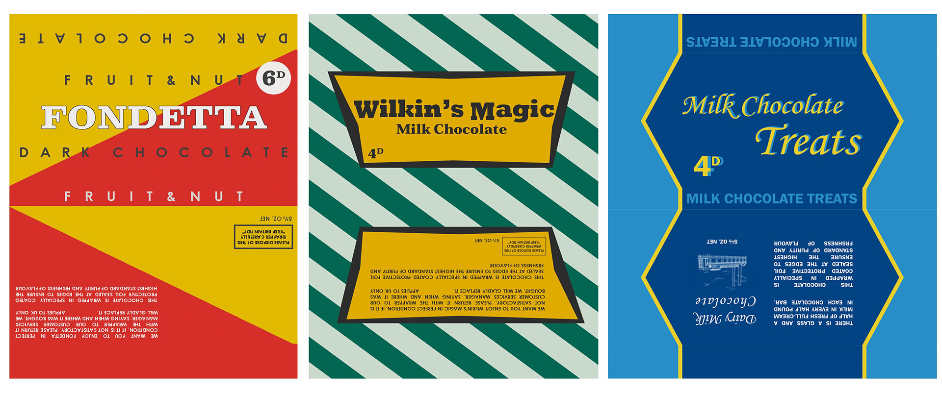
During my work experience, with the art department team for the BBC drama Call the Midwife, I got the opportunity as a graphic designer/ art assistant; to help with the designing and creation of props. As this TV series is set in the older period, it meant that we had to create visual that were suitable fro that time frame. This meant extensive research into the design, layout and colour concept. My main role in this position was to create some candy wrappers for the sets sweet shop and other props that could be seen in the frame. As we had to set the scene of the sweet shop, it required many different designs to help make the shop look full. The reason why we had to create all these props and not use existing one is because of copy write, but also the packaging today were too modern and had a different aesthetic to the ones in the past. While researching into colour themes, you could see the consistency of products using bright and bold colour. Applying this concept into the design was effective in creating a props that looked like it was from that period. What I learnt in this experience was how to adapt in design when creating something that was seen in the past and how very different that design is to modern designs.